

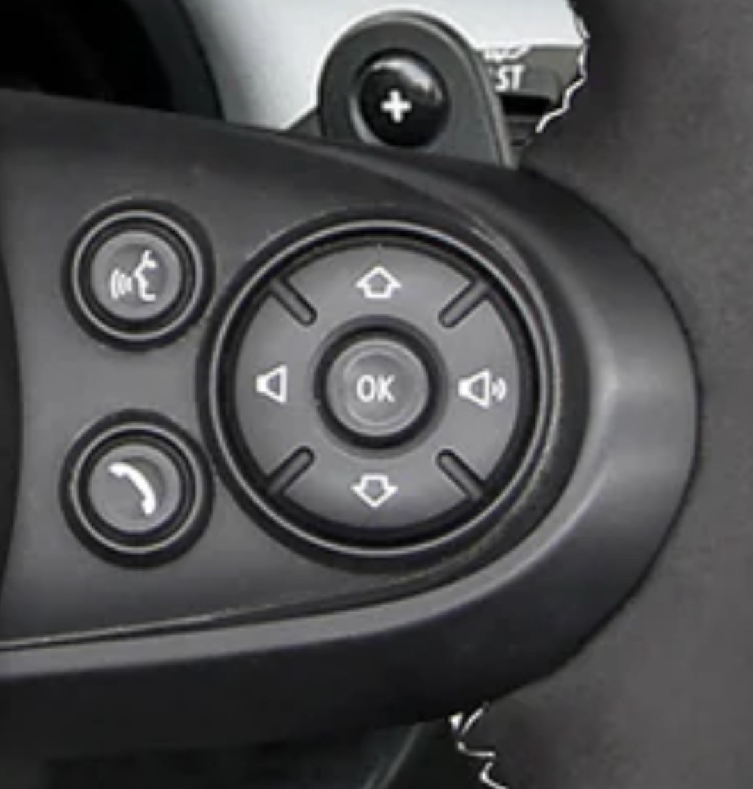
This layout makes sense if you have used an old school mp3 player or similar.
Volume is left and right because it’s an analog of the volume bar on the screen.
Up and down is previous and next because play was controlled by a list UI so you were moving a cursor up and down between songs.
It’s not how I personally would prefer it, but it’s not as outlandish as it seems.
Hey, at least it’s not a touch screen :)
Nailed it. Even the worst interface with buttons is miles away from the best touchscreen interface. You are like driving, you aren’t supposed to look at the screen and tap things on it to switch a song or whatever. You navigate a missile that weights at least two tones and can undo a crowd of pedestrians or break a wall in a building. You are in no position to focus on this tiny LED that some insane idiot mounted there. Yet, it’s there.
