Ah, the marketing department had to justify their existence, didn’t they?
EA can suck it.
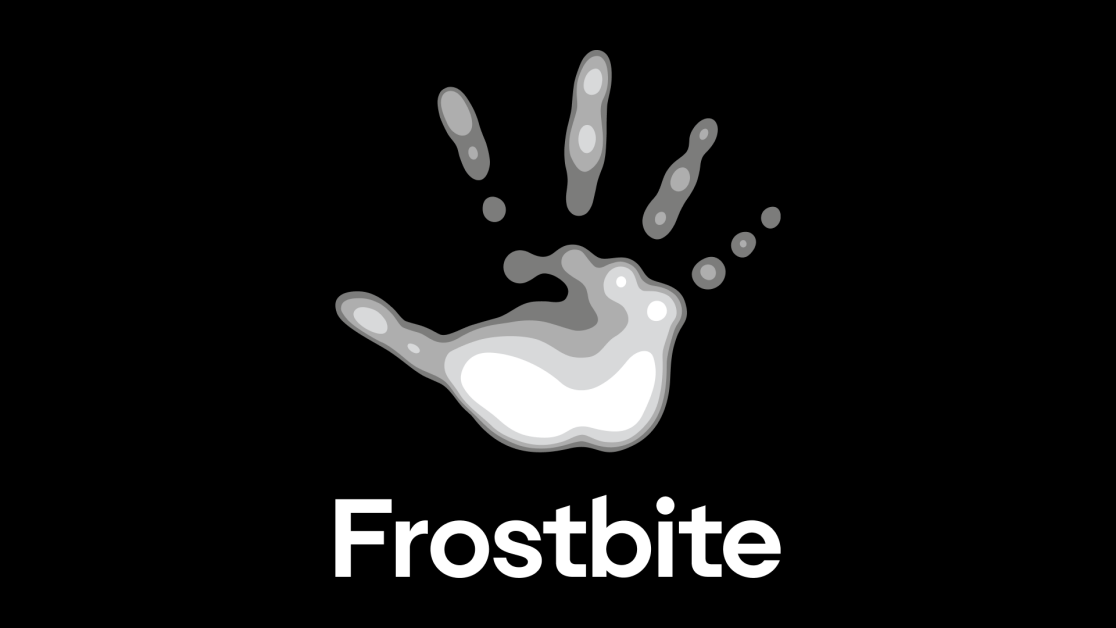
The hand can be used to fondle the balls or tickle the asshole.
They made the logo more complicated any playfull. Is the long awaited counter-trend train to ultimate minimalism finally leaving the station? I certainly can’t wait!
It’s pretty cool how they documented the design change. I thought the 2013-2023 version looked the best but I gotta admit that the new one looks pretty slick when it’s combined with the cover art.
I really agree. As quick as I am to be cynical about low-impact press releases from a conglomerate, I do find it interesting to read through design changes and the symbolic meaning in branding.
I really thought they were going to distance themselves from the unfortunate use of a hand to represent the name frostbite.
But no, just went and drew the fingers falling off.
Great work, guys.
After many conversations about how to represent this new chapter for Frostbite, we realized that starting from scratch wasn’t the answer. We wanted to preserve the best parts of who we already were, and for us, that meant keeping the Frostbite hand.
There are farmers growing food without which life is literally unsustainable making less than these people made for having multiple debates that essentially amount to “should the drawing still be a hand?”, the way in which our society judges and assigns value is so fucking funny honestly
It looks blurry like it hasn’t loaded properly.
You need HD Textures dlcs for that