

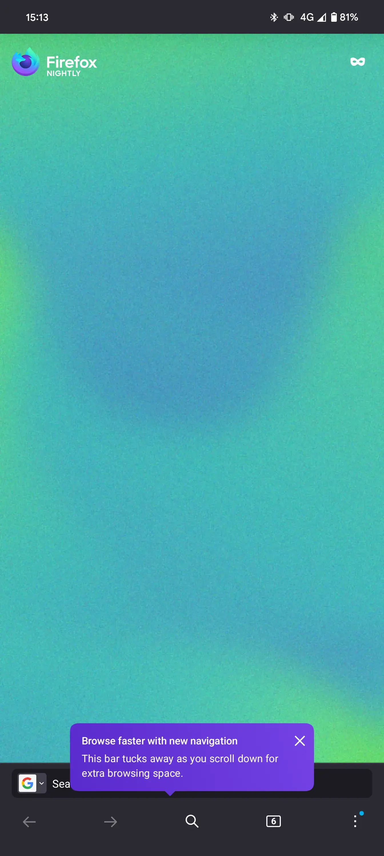
With the version 130, Mozilla introduces a new navigation bar in Firefox for Android. If you don’t like it, you can disable it in the “Secret Settings”.
I was not a fan when it popped out on my screen. But, after sometime, it’s pretty useful and saves a tap on the three dots button.
I had already seen this design a few weeks back and was then, as I am now, not very excited about it :^(
It’s possible they’re trying to address the issue of the old toolbar being too crowded, and that’s neat, but I don’t think this is the right way to go about it:
- Many people don’t use visual back and forward buttons, me included. And I don’t intend to use them anytime soon—my phone already has a back button, and I genuinely can’t remember when I last wanted to go forwards.
- The “new tab” button is an interesting shortcut, but the functionality was already there in the long-press action of the tabs button. I’m sure this will be useful to some people, but again, not me. That’s 3 useless buttons on my screen, now.
- If you change the address bar location to top in the customization settings, this design starts making a bit more sense, but that’s not exactly reassuring. I put the address bar on the bottom because I like it there, I like being able to quickly change or edit the URL without reaching for the top of my phone screen.
- When they eventually implement tab grouping, assuming users get a quick tab group nav bar near the bottom, this toolbar will look ridiculous. With that height, it’ll be less like a toolbar and more like an entire mission control center eating up your screen.
So…
It seems like they had the right intentions, but somehow chose a really weird direction to go in. I don’t like that the way to disable this is hidden in the secret settings, it doesn’t exactly give off the impression that it’ll remain an option in the long-term. I’m going to try sharing my feedback with Mozilla, hopefully it’ll be useful.
P.S. it’s far from all bad. I’m actually really interested in the new three-dot menu design, and there’s a lot I could write on why. It’s just that the toolbar is the most used and seen part of the browser; is it really asking for much to have it be closer to my ideal instead of an abstract generic user’s?
P.P.S. upon further thought, large parts of this comment are just plain silly. Come on, I trust they’ll add a toggle as the feature leaves nightly, it’s clearly not ready yet. This is what happens when you forget nightly is for testing, you make a fool of yourself on lemmy. Some concerns remain (e.g. tab grouping), but again, that’s what constructive feedback is for. I’ve already seen multiple people very happy about the navbar, to the point that I almost feel bad for not liking it, ha
I agree with you entirely on this.
Got used to the new bar quickly, however I absolutely dislike that they hide parts of the URL.
Didn’t find any related config in about:config or secret settings.
With this, I’m probably going to continue using the old navigation bar.
I don’t know if that’s the final design, nor if they plan to make it universal (applies on both new and old design) later on. Probably worth looking into, I’m not a fan and would rather be able to use any design with the full URL.
Where are th secret settings?
You need to enable the debug menu by taping multiple time on the Firefox logo in Settings -> about Firefox.
Once the debug menu is enabled, you will find “Secret Settings” in the Settings.
Oh wow! I didn’t know this. Thank you.
At least you can disable it.
Please show me the mozilla connect post, where at least 30 people said they want this.
How can they fuck up the UI without anyone requesting it?
Makes a lot of sense to me that Mozilla Connect isn’t the only input to the roadmap. Perhaps they did user testing and found that people were struggling to find the back button or use tabs, and they’re testing if this makes some of those tasks easier.
I don’t know. They are working on a menu redesign too:
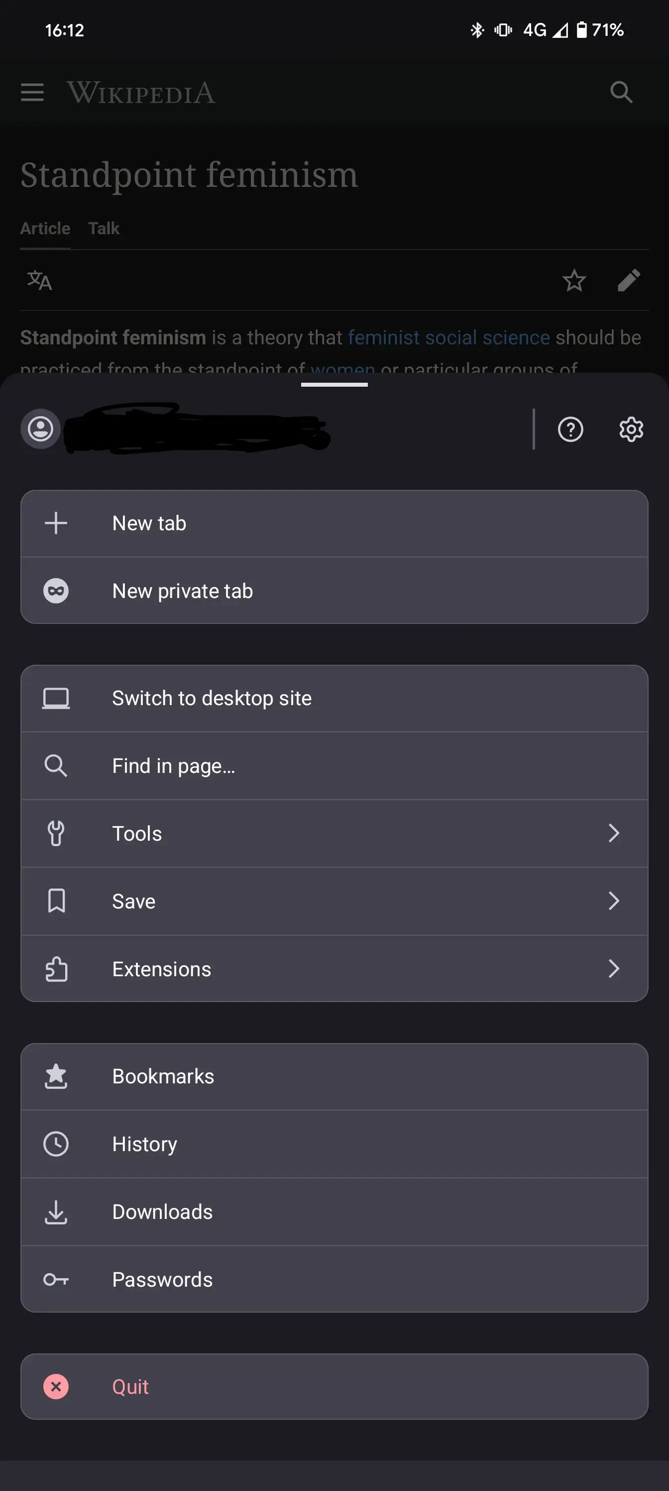
I think the menu redesign looks great personally
I like it. It’s easier to use and clearer.
What?? Ugly as heck
Hmm, just updated my Nightly. I didn’t get that toast, and it’s not hiding away for me as I scroll, but I don’t hate it. Vertical screen real-estate isn’t actually that precious, and though I usually swipe to go back, going forward was a bit of a hassle. It also appears to use the single bar in landscape mode (although currently with an empty black bar above it, but that’ll surely go away), where vertical screen real-estate is rarer.
Ohhh I’m excited!
Strong dislike, I like my bars at the top, not the bottom. Looks like it’s disableable for now, but will it always be?


